If you have a business, then chances are, you have a website to represent that business online. It’s basically your 24/7 digital salesperson. To make it your most effective asset, you must make sure to avoid any web design mistakes. Let’s take a look at the few most common ones which can result in huge pitfalls if not solved at the right time.
1. Missing Call to Action When a User Arrives at Your Website
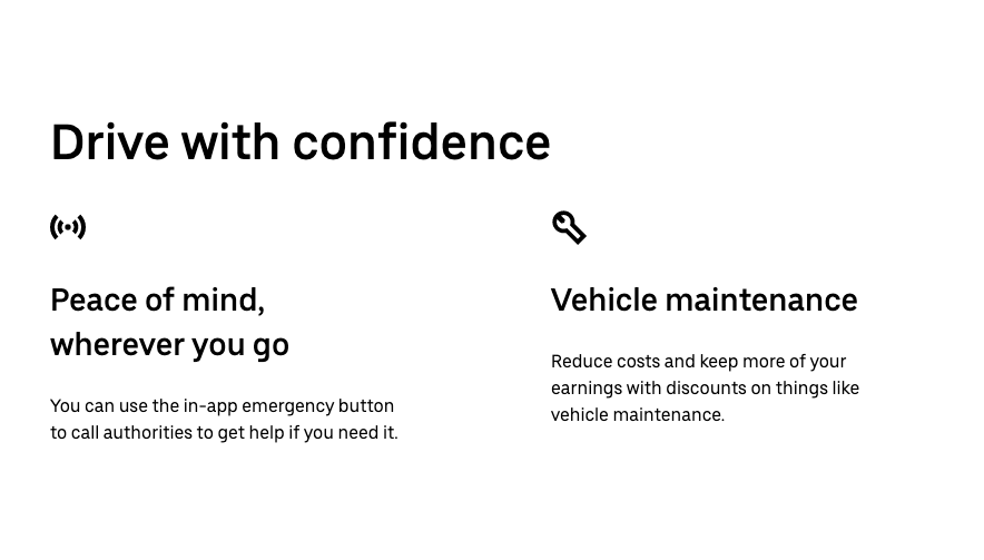
A clear call to action is quite important for you and your target audience. It’s a button that you use throughout your website to tell users what their next step should be. For example, it could be as simple as “contact us”, “buy now” or as complex as “schedule a call”, “25% discount only till Monday” etc.
Ideally, you want to make sure your customer is never far away from buying into your product or service. Here’s what it looks like in the wild.

2. Outdated Blog Content…or Non-existent
Everyone is a consumer of content. From a social media enthusiast to a television savvy user or an audiobook maniac, it’s all a content drill down. We simply just can’t get enough of it. If you’re not regularly adding to or updating your website’s content, then you might be losing out on building relationships with your target customers.

If you have content they enjoy or find helpful, like a blog or resources page, then they’ll always come back for more. New content is also a great addition and also, an easy way to boost your SEO efforts. So it’s totally a win-win situation for your business & brand.
3. Text That Makes Users Go BLIND
BLIND… Not in a literal sense of it. When a user visits your website you have just a handful of seconds to capture their attention and keep them engaged with your business digitally. They won’t stick around if they can’t even comprehend the words on the webpage. There’s a lot of ways to mess up the readability of your content:
- Difficult script or handwritten fonts
- Overlaying text on busy images or backgrounds
- Not enough spacing between lines or words
- Putting text in a color that doesn’t have enough contrast
All you need to do is make sure that you’re not committing any of these crimes when building your web presence.

4. Graphics That Don’t Match Brand Guidelines
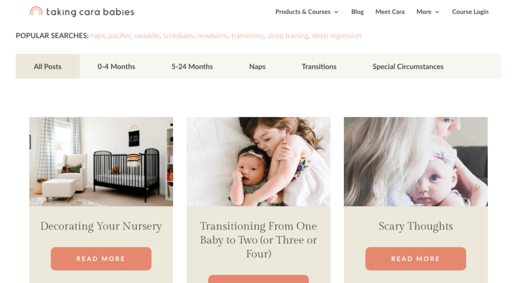
We all know the saying “An image is worth a thousand words.” This is so true when it comes to your business website. You need to make sure that your images convey the right words with whatever visuals you put on your website. Graphics, vectors, and photography should reinforce and complement the content of your website, not distract the user away from it.

If you use stock photos, try selecting ones that look natural or that have models that accurately represent your target user demographic. Lastly, remember that if you tend to use icons and illustrations, then they should have cohesive color and style to add value.
5. Abundance of Links on the Main Menu
For almost every small business across the globe, I’m willing to bet that there’s at least one thing sitting in the main navigation that users don’t need (or don’t expect you to put there).

Just like text that is hard to read on a webpage, bulky or confusing navigation can also cause users to opt-out of your website. This can further result in the loss of potential business. Clutter in the site’s menu is overwhelming and leads to uncertainty on which page to go to next. You want to give users information that is easy-to-digest so they feel calm and confident about what you’re offering in your business and how they can get it. When in doubt, keep it simple, always!
Conclusion: Fixing Your Website
Whether it’s quick fixes or more of a long overhaul, it’s always a good practice to hire a professional b2b web design company to get the job done right and avoid any web design mistakes. I hope this article was helpful to you and served value.


